


Your Headshot day should feel relaxed, joyful, and completely yours.
I’m Alex Kaplan, a Headshot Photographer and videographer based in New Milford, NJ, serving Northern.
Browse by Category:
headshots
view more

REQUEST INFORMATION
Want to feel like THIS on your Headshot day?
Availability is limited. Check Your Date Here

Most people spend more time stressing about what to wear before a headshot session than anything else. In over 30 years of photographing professionals throughout Northern New Jersey and New York City, wardrobe anxiety is one of the first things I hear when someone books a session with me.
Here’s what I tell them: the question isn’t “what’s the perfect color to wear?” The more useful question is “which colors should I avoid?” That shift usually solves it.
What Colors Should You Avoid in Headshots?
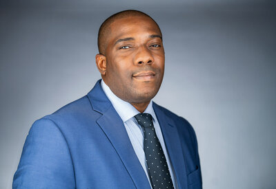
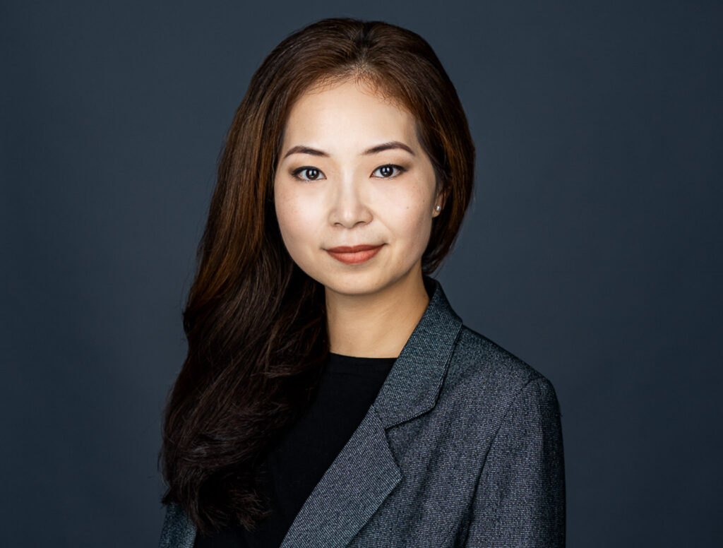
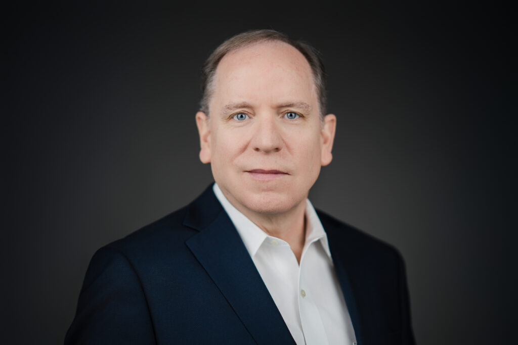
Avoid neon colors, bright reds, loud patterns, and heavily saturated tones in professional headshots because they pull attention away from the face. Solid, muted tones like navy blue, charcoal, earth tones, and soft neutrals tend to photograph more cleanly and read as more professional on camera.
Why Clothing Matters More Than Most People Realize
When anyone looks at a professional headshot, they spend about half a second on the clothing and the rest of the time on the face. That’s the goal. But certain colors and patterns break that sequence.
If clothing is the first thing people notice in your headshot, the outfit is overpowering the photo.
This matters most for corporate headshots and LinkedIn profiles, where the photo is often the first impression someone gets of you professionally. Once you know what to avoid, the rest takes care of itself.
The Biggest Mistake People Make Before Headshots
Most people reach for their favorite outfit. That’s understandable. But your favorite outfit and a camera-friendly outfit are often two different things.
A bright coral top might look great at dinner. Under studio lighting, it can bounce color onto the face and shift skin tones in ways that are difficult to correct. A bold graphic tee might feel like an accurate expression of your personality, but the moment there’s visible text or a logo in the frame, the viewer reads the words instead of looking at you.
One thing a lot of people don’t know: trendy colors and statement pieces date a headshot faster than almost anything else. A good headshot should still look good five years from now. Solid, classic tones are what get you there.
Most people already have something in their closet that works perfectly fine. They usually just need one clean outfit that doesn’t distract from them.
7 Colors That Usually Don’t Photograph Well
This list isn’t absolute. A skilled photographer can work with a wide range of wardrobe choices. But after photographing thousands of professionals across New Jersey and NYC, these are the colors and clothing types I recommend against most consistently.
1. Neon Colors Electric green, hot pink, bright orange. Neon tones are extremely difficult for cameras to process accurately. They oversaturate in the final image and immediately pull visual attention away from the face.
2. Bright Red Red photographs hot. It can bleed at the edges and in some lighting situations create a color cast on nearby skin. A deep burgundy or brick red often works beautifully. A fire-engine red rarely does.
3. Extremely Bright White Bright white reflects light aggressively and can blow out fabric detail near the neckline and shoulders. An off-white, cream, or soft ivory photographs just as cleanly and gives the camera a lot more to work with.
4. Loud Patterns Patterns pull attention away from the face. The eye keeps shifting between the clothing and the expression rather than settling where it should. Worth knowing specifically: thin pinstripes are a particular problem. They can create a moiré effect- a kind of visual shimmer- that is nearly impossible to fix in editing.
5. Distracting Graphics or Logos Any visible text or logo pulls attention immediately. Even a small emblem becomes surprisingly distracting once you notice it. Band tees, sports gear, branded corporate wear- all of it.
6. Overly Saturated Colors There’s a camera-friendly version of almost every color and a version that isn’t. Electric blue versus navy. Bright kelly green versus forest green. The oversaturated version competes with the face. The muted version supports it.
7. Reflective or Shiny Fabrics Sequins, satin, and other reflective materials create unpredictable glare under studio lighting. Pure black is worth mentioning here too: it tends to lose fabric detail unless it’s styled carefully. A very dark charcoal almost always photographs better.
Why Navy Blue Works So Well in Professional Headshots
If I had to choose one color that performs consistently well across almost every session, it’s navy blue.
Navy just photographs cleanly almost every time. It doesn’t compete with skin tone, holds its depth under studio lighting without going flat, and works across industries from law and finance to tech and healthcare. It doesn’t date a headshot the way trendier choices do.
For executive portraits and corporate photography, it’s close to a standard for exactly these reasons. It signals credibility without announcing itself.
Charcoal gray, deep teal, soft burgundy, forest green. They all work for the same reasons. They stay out of the way..
Why Solid Colors Almost Always Beat Patterns
When in doubt, go solid. No competing shapes, no lines pulling the eye. Very fine textures can add depth without causing distraction. Bold patterns make the face the second thing you look at instead of the first.
How Clothing Fit Affects Headshots More Than Brand Names
Fit matters more than brand or price. I’ve photographed people in inexpensive shirts that looked polished on camera and expensive jackets that looked awkward. The fit was the difference every time.
For a headshot cropped from the chest up, the neckline and shoulder line are what I notice first when someone walks in. If either is off, it shows immediately in the frame. You don’t need to go shopping before your session. Something that fits cleanly and sits well on your shoulders is all you need.
What Actually Matters More Than Clothing Color
I had a client come in a few years ago who had spent a week preparing for her session. Three wardrobe options, a printed list of questions, reference images. She had done everything right on paper.
But when she sat down in front of the camera, she was so focused on every detail that her expression was tight for the first dozen frames. We paused. I asked her about a project she’d mentioned when she booked. She started talking. She smiled at something she said. That was the frame that ended up on her LinkedIn profile.
The goal isn’t to look overly styled. The goal is to look like yourself on a really good day.
The wardrobe advice in this article is real and worth taking seriously. But the expression is what carries a headshot. A relaxed, genuine look communicates more than any clothing choice ever will. That’s what I spend most of a session working toward with every person I photograph.
With more than 625 five-star Google reviews, most of the feedback I hear from clients isn’t about outfit decisions. It’s about how natural the photos felt, and how the final images actually look like them.

Don’t Overthink Your Headshot Session
Most people overthink wardrobe before a headshot session. Once the lighting, expression, and fit are handled well, the whole thing becomes a lot simpler than people expect. Wear something solid, muted, and well-fitted. The camera takes care of the rest.
If you’re planning a professional headshot session in Northern New Jersey or New York City and have questions about wardrobe before your appointment, I’m happy to talk through it. A quick conversation beforehand can take most of the guesswork out of the day.
Call 917-992-9097 or 201-834-4999 to book or ask anything before your session.
Reply...


